
The Challenge
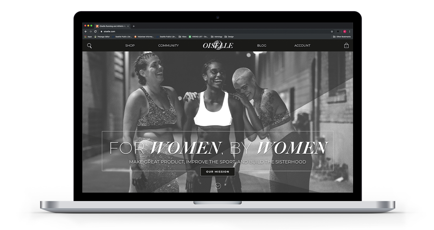
Oiselle is a Seattle-based retail company that focuses on empowering women by making running apparel for all shapes, sizes, and athletic abilities while cultivating a supportive community. Despite their strong mission and dedicated following, they have hit a plateau in their growth. Considering they only have a single brick and mortar store and the majority of their business is online, a website redesign became a priority for increasing brand awareness, sales, and positioning Oiselle as a more competitive name within the running e-commerce world.

Made as a conceptual piece at the School of Visual Concepts
Instructor: Ramil Azucena
Timeline: 9-weeks
Tools Used: Photoshop, Illustrator, Sketch
Skills: Brand Discovery & Development, User Research, Information Architecture, Wireframes, UI/Visual Design
“I HAVE BIG GOALS, BUT I WANT TO GROW THOUGHTFULLY.”

Process
01. Explore as The consumer
My first step was to learn about Oiselle’s brand outside of the clients POV and instead from a consumers viewpoint. I visited their retail store at University Village as well as spending a considerable amount of time exploring their website, both acting as a shopper and a visitor seeking community.


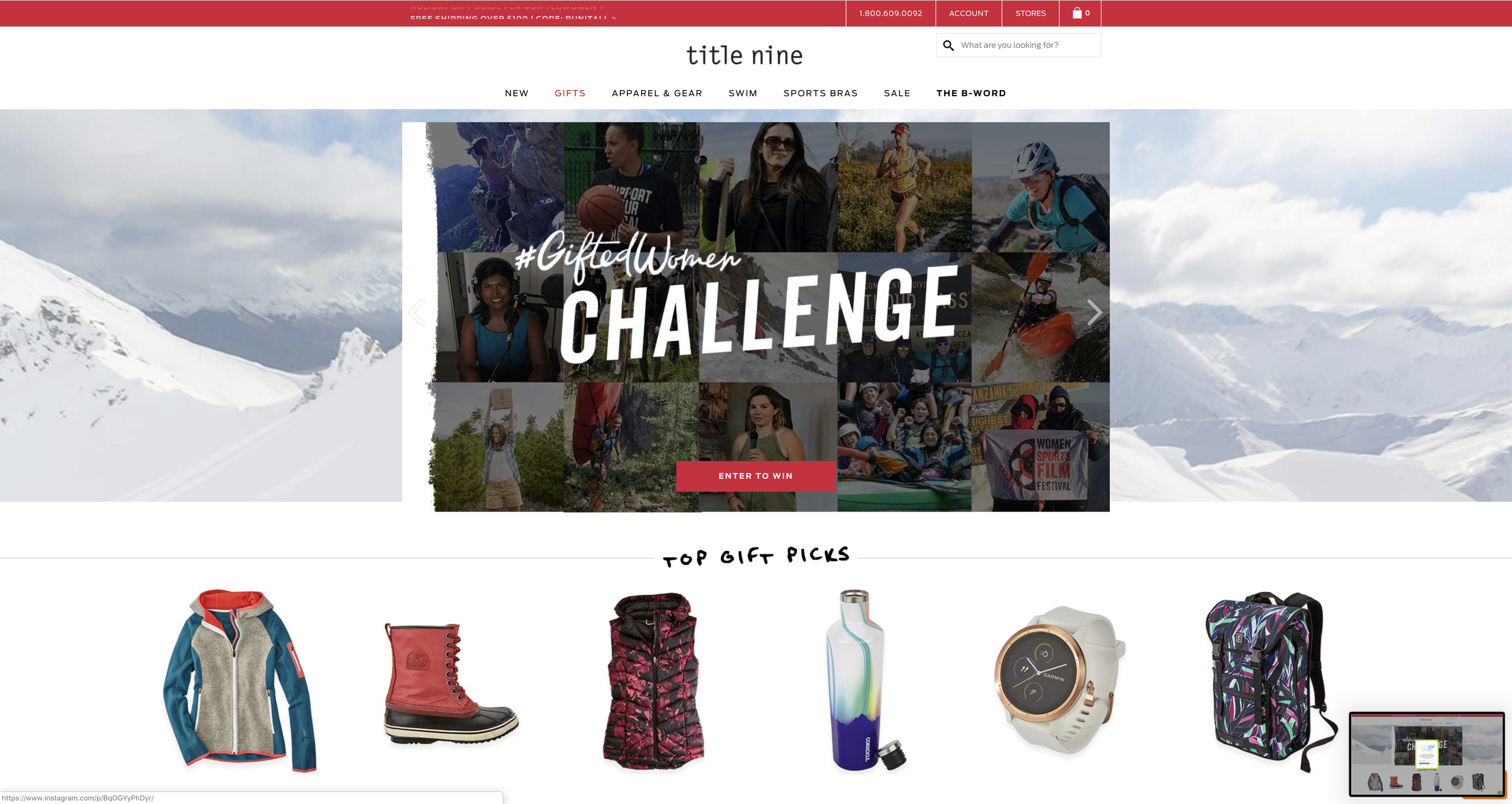
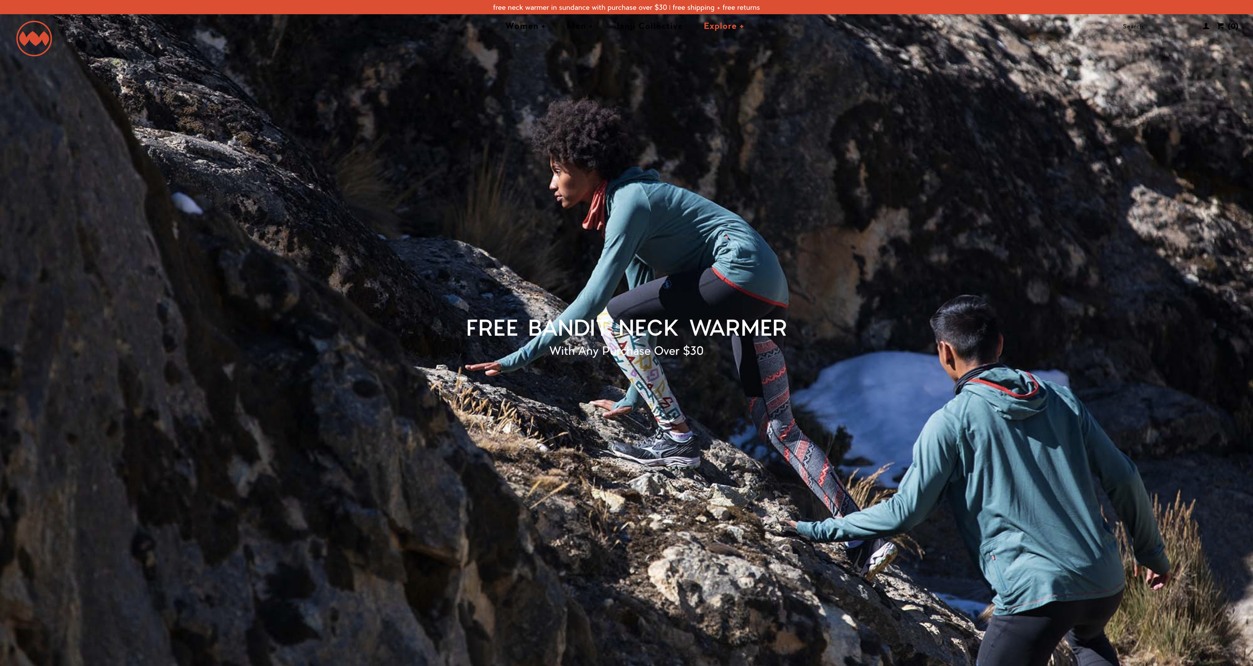
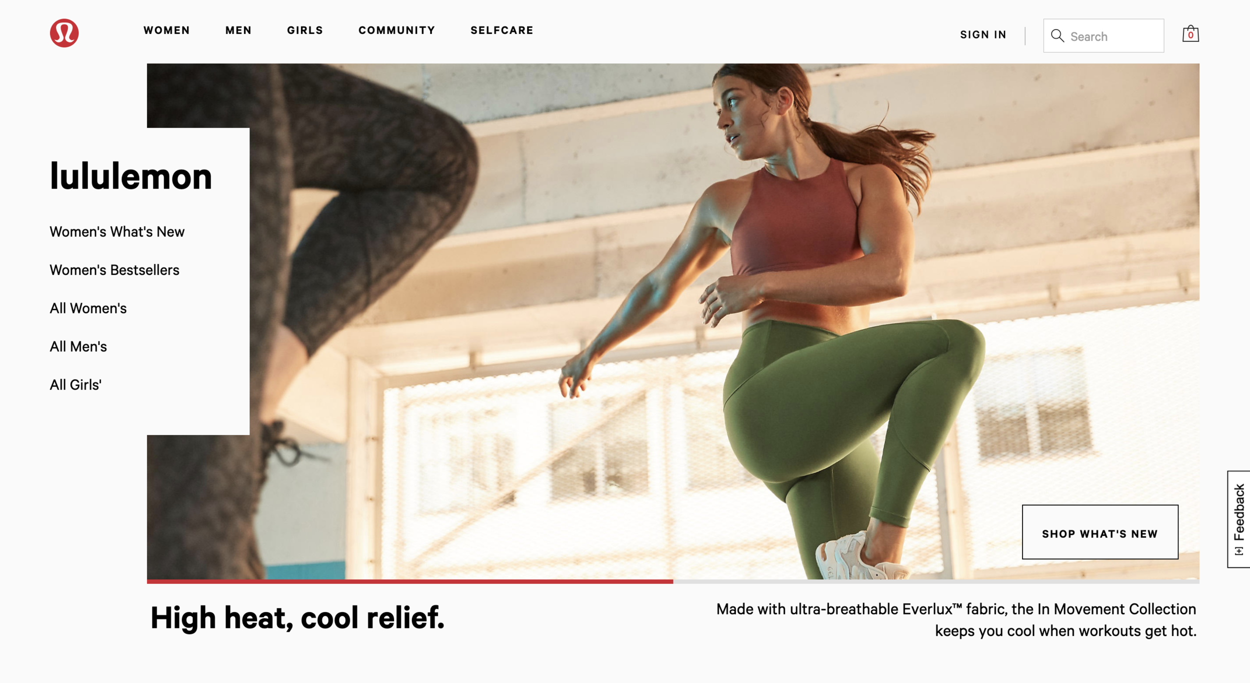
02. Know the competition
I conducted an analysis of Oiselle’s top competitors to see a birds eye-view of how Oiselle fits in and stands out amongst others. The seven companies chosen were a mix of industry leaders and niche proprietors.
03. Meet the customer
Oiselle’s customer base are mostly middle-upper income females who are already dedicated runners. Oiselle would like to reach out and broaden their scope to encompass a more diverse customer base.
Cynthia is more of a casual running enthusiast who doesn’t have an allegiance to a particular brand yet, but she is partial to companies who deliver high quality, functional, and fashionable options. She represents Oiselle’s secondary target audience and their best option to start expanding their demographic.

Strengths
Fashion-forward, performance-focused
Authentic in mission and vision, strong brand voice
Representation of diverse women
Thoughtful and striking photography
Opportunities
Embrace their luxury brand price-point
Create a stronger brand presence across platforms
Clean up and streamline the navigation
Make Oiselle a '“lifestyle”
04. Set The Mood
During my process, I was hyper aware that I needed to find a way to merge fashion and athleticism, the fierce and feminine. However, I also wanted to instill a sense of higher fashion that a customer would expect when shopping at Oiselle’s price-point without becoming elitist and alienating a shopper like Cynthia.

05. Lay It Out
From simple to dynamic, my iterations allowed me to explore how to powerfully represent different aspects of the Oiselle brand—retail, lifestyle, community—early on in development. They also helped me to break out of a more traditional layout or reign me back in when I was being too ambitious.

OISELLE IS DYNAMIC AND MODERN.
OISELLE IS FIERCLY FEMININE.
OISELLE IS A SISTERHOOD.

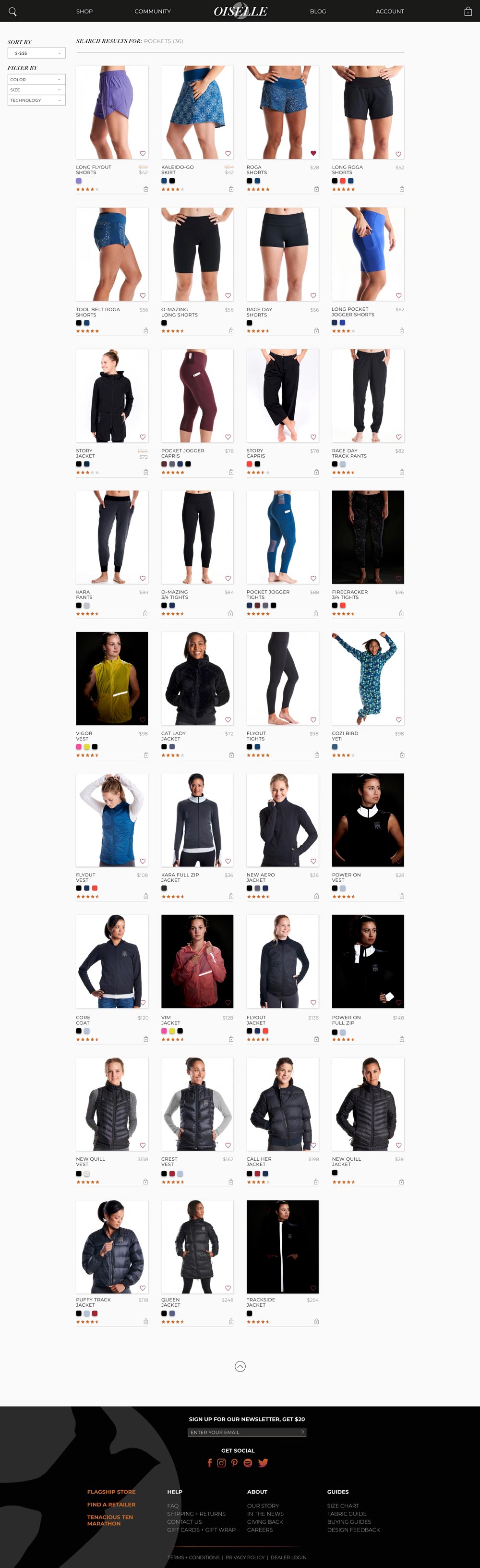
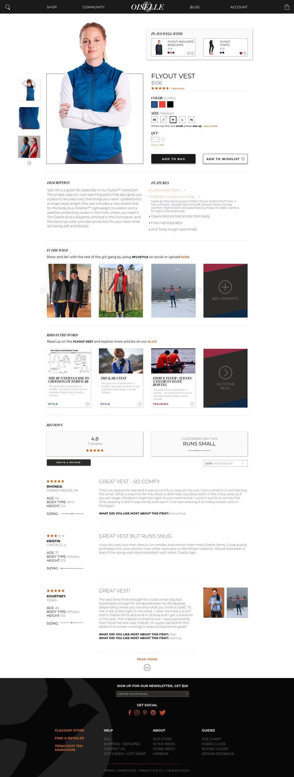
Solution
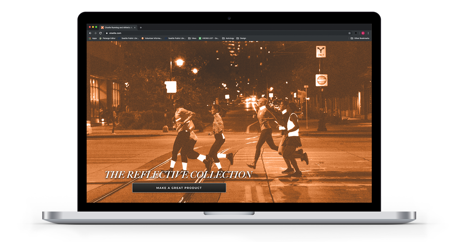
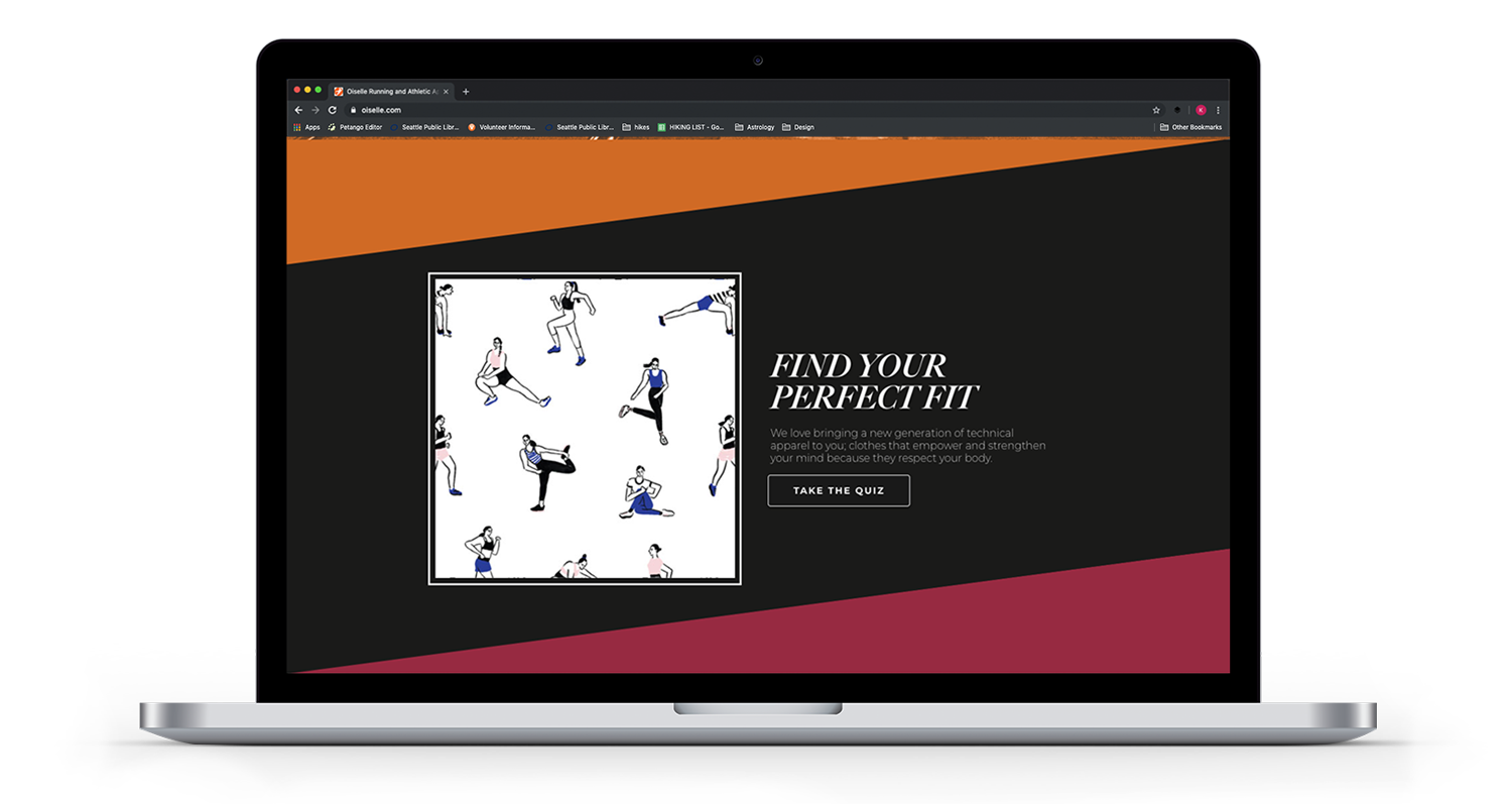
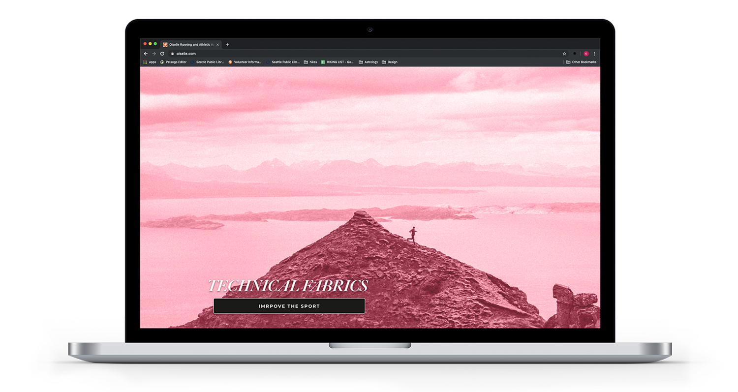
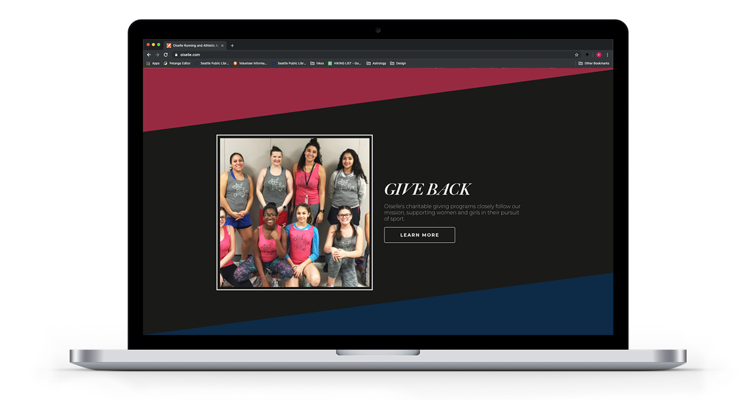
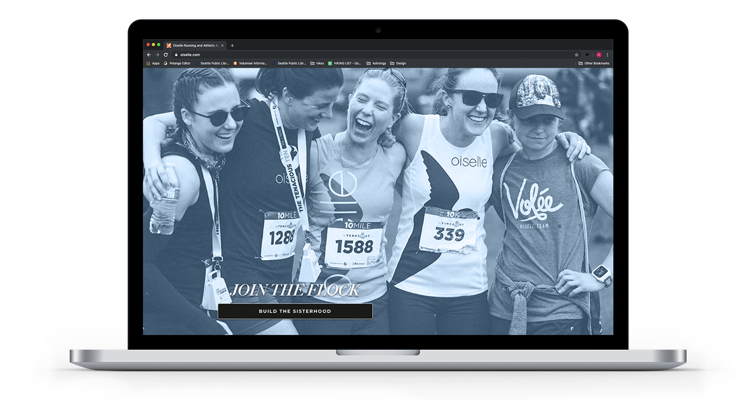
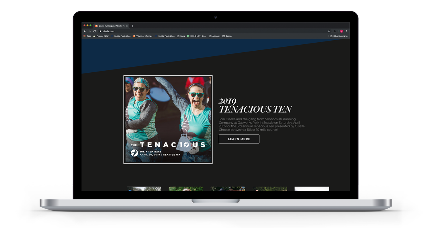
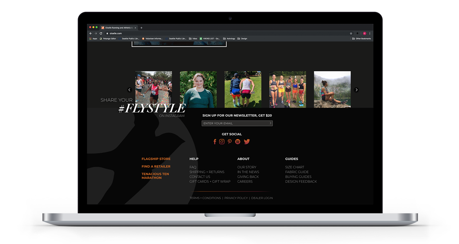
Desktop
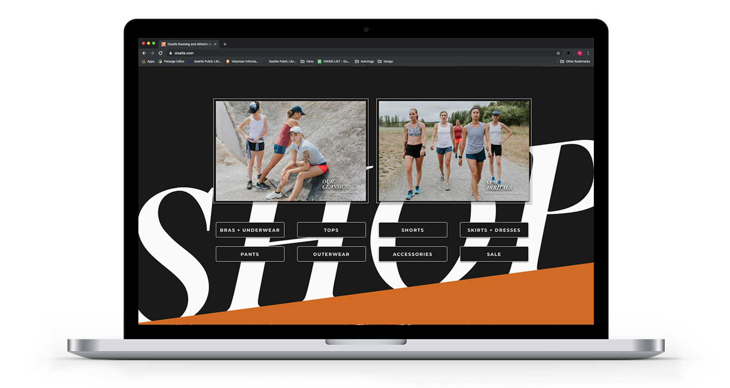
The redesigned shopping experience is all about online shopping efficiency with an end goal to have a customer purchase more and return less.
Hover over images to see menu interactions.
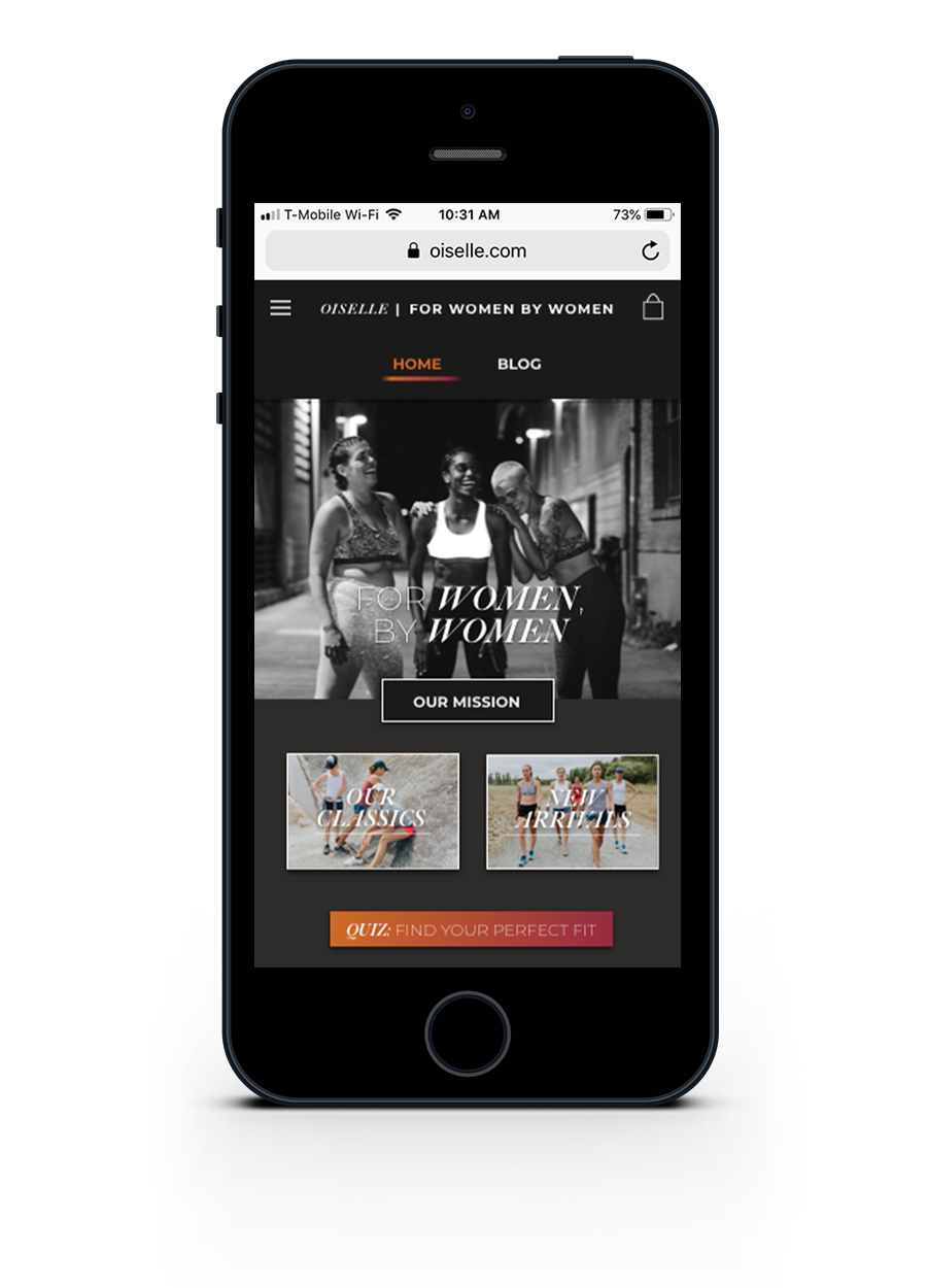
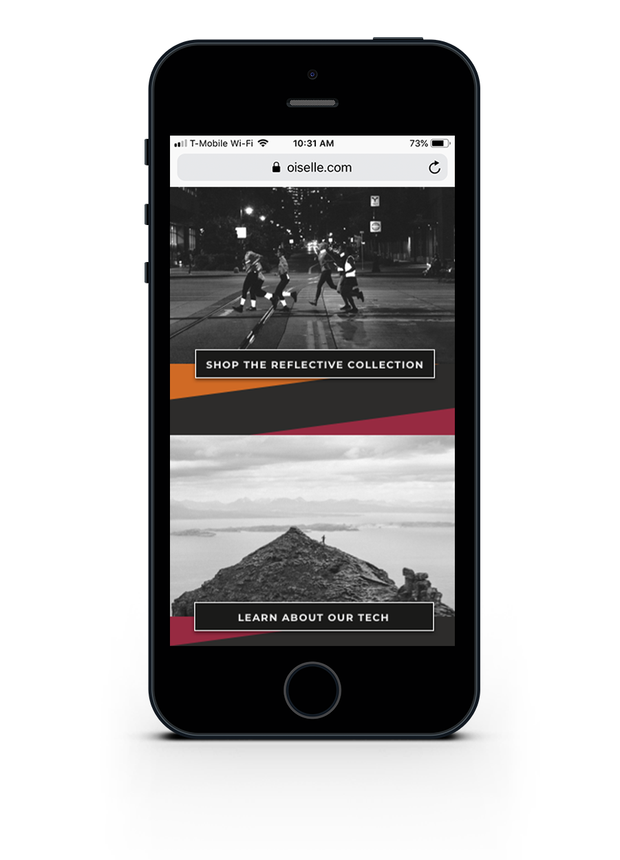
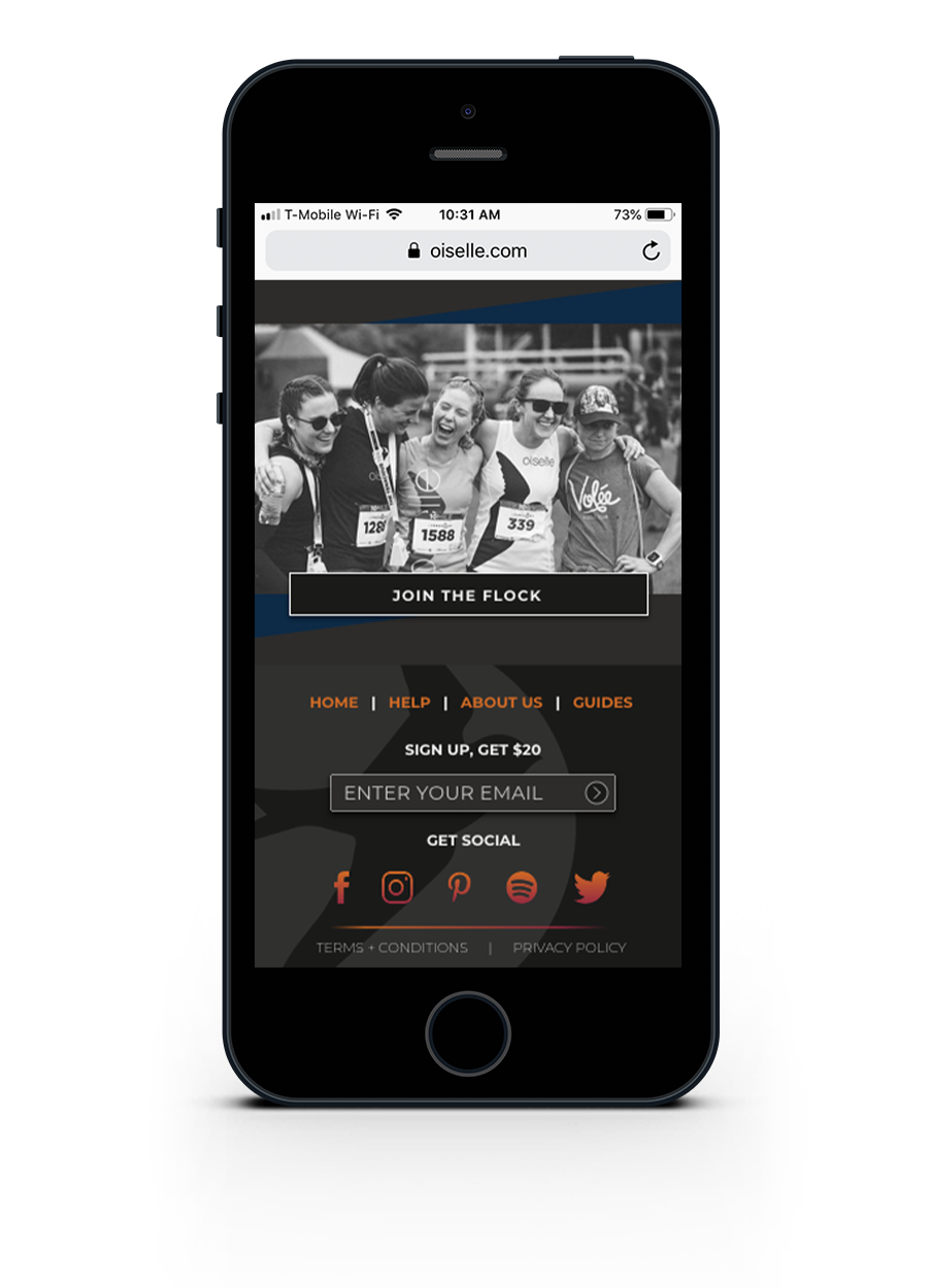
Mobile
With an on-the-go mobile user is mind, I shorten the page lengths and I streamlined the experience by keeping only the essential functions and content.