Using the liner notes of The Beatle’s groundbreaking album, Sgt. Pepper’s Lonely Hearts Club Band, I created a book as a tribute to my favorite band.
The assignment requirements included using all text found in the liner notes, styling the lyrics section in both prose and paragraph form, as well as developing a creative driver, which is a statement that represents your visual concept.
Instructor: Jeff Barlow
Deliverables: Printed and bound book
Timeline: 5-weeks
Tools Used: Photoshop, Illustrator, InDesign, Photo Copier, Laminator
Awards: 2019 American Advertising Federation (AAF) Silver ADDY Award, Local (Seattle) and District 11.
“The Beatles insisted that everything on Sgt. Pepper had to be different, so everything was either distorted, limited, [or] heavily compressed.”

Concept & Creative Driver
This album was created during a time in The Beatles’ history when they no longer wanted to be “The Beatles.” Wanting to keep in mind the collective mindset of this time and stay true to their history, my creative driver behind this book comes from—despite the hundreds of other theories—the fact that this album was about drugs. The Beatles had intentionally lost touch with reality and I wanted to explore that typographically throughout the book.

01. research
Having been a fan for many years, I had luckily done some “pre-search” which included a visit to Liverpool and completing the college course “The History of The Beatles” at Indiana University.
When it came to the design, I knew that I wanted the visual aesthetic to feel authentic, so I spent considerable time looking at old books and records from the late Sixties for my visual inspiration. Since authenticity was so important to me, I also spent time researching and experimenting with analog techniques that could help me achieve my desired typographic effects. So if you ever need a prism, get ahold of me.
02. TYpographic Exploration: POster Design
Before I created the book, I completed an assignment to typographically represent a single song off of the album. For this I chose “A Day In The Life”. My interpretation of this song was to explore the concept of duality.
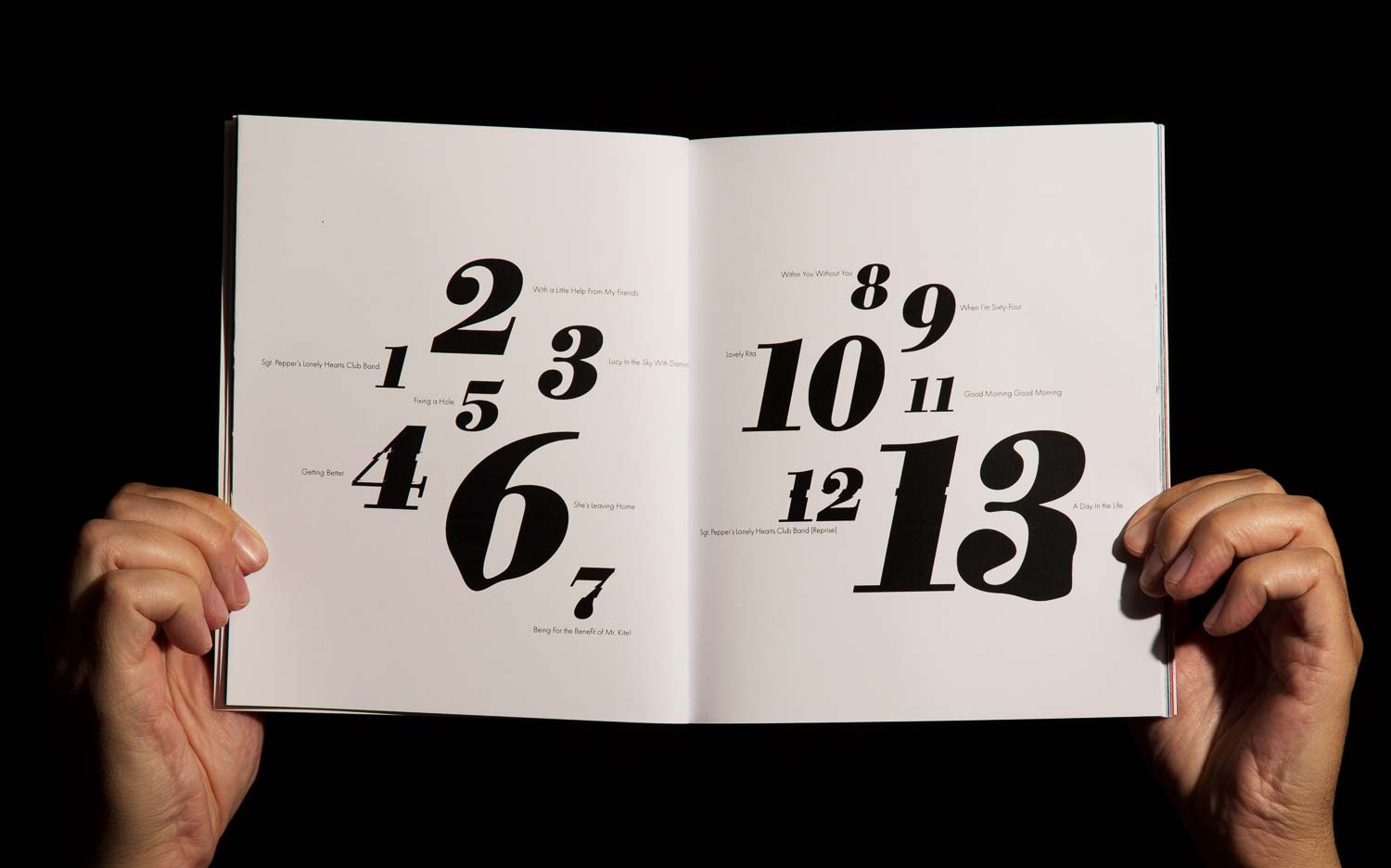
03. Pagination
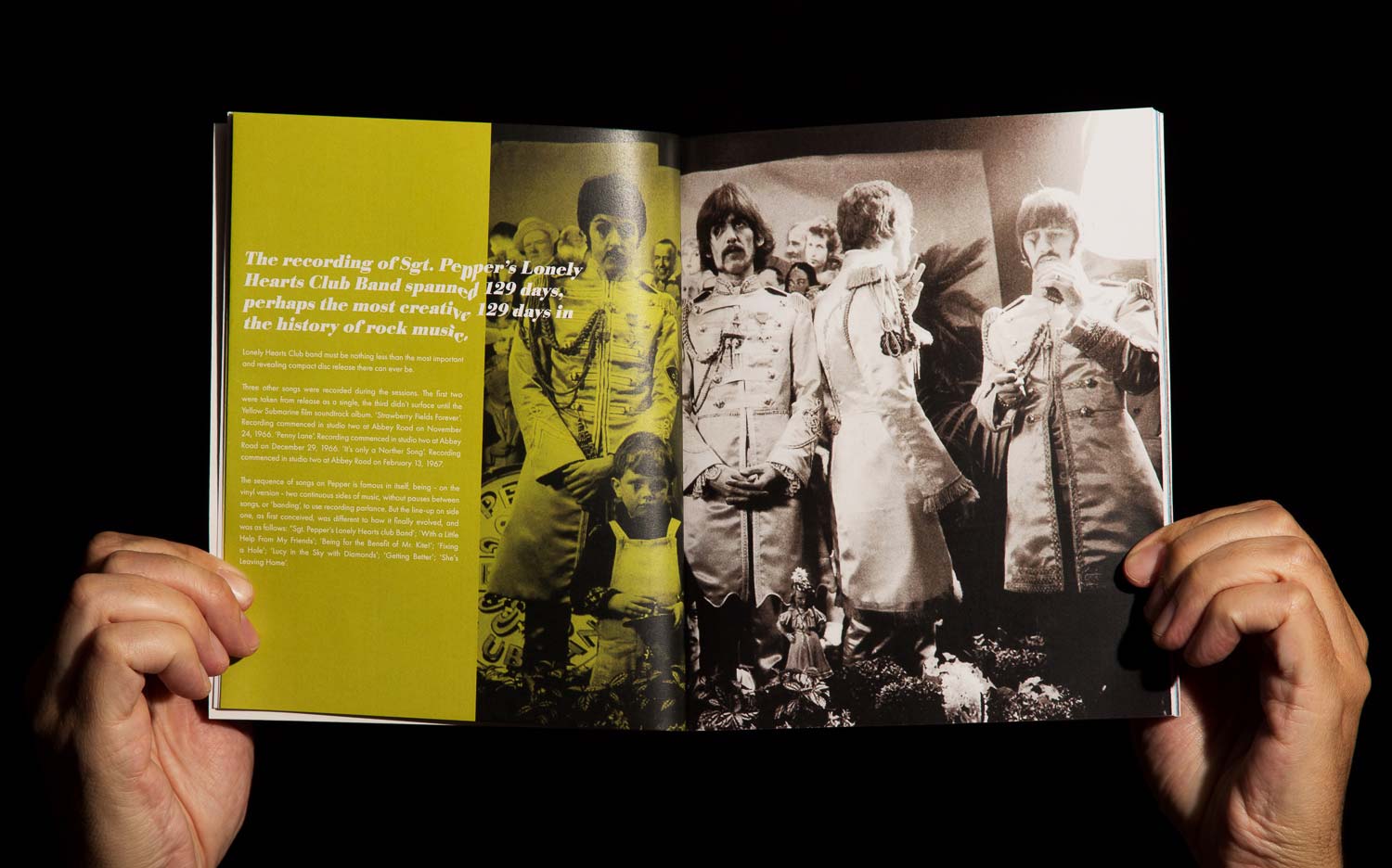
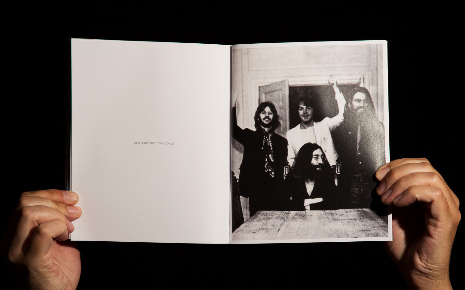
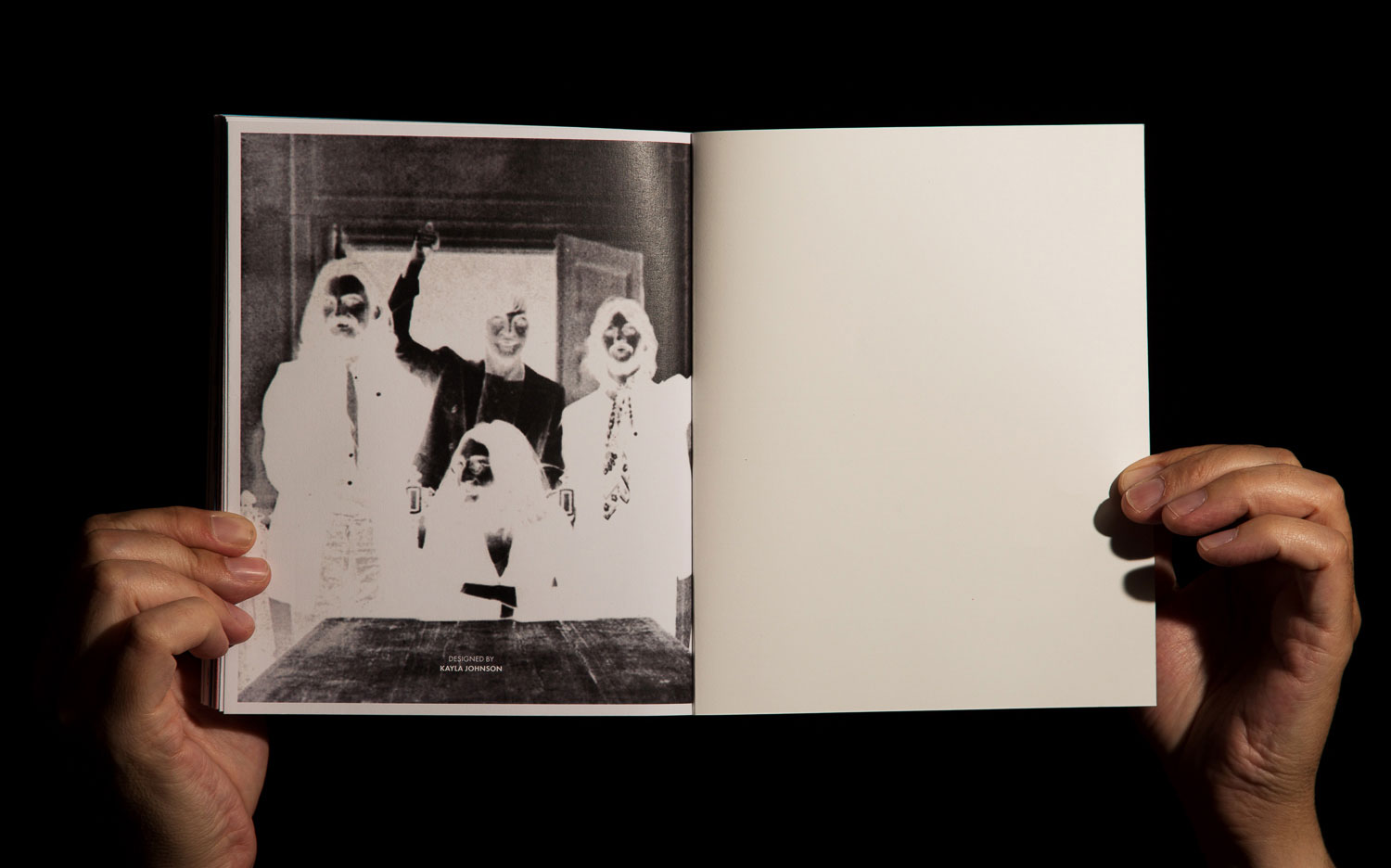
The books ascent to madness is inspired by the musical flow of A Day in the Life—I hope you’re noticing a theme here. (listen). I started quiet with an introduction to the album, created a crescendo of song title manipulations, brought it back down to a tighter, cleaner layout, before getting quiet again for a big finish. To break up each section more, I interspersed interviews and writings on the album along with full-page image spreads overlaid with a Timothy Leary quote.
“Sgt. Pepper was a drug album.”

Lyrical Prose Spreads
The prose section of the book explores the path from sanity to insanity with the movement and distortion of type. The colors created by the distortion also mirror the colors throughout the album’s original artwork. Here are some key spreads from this section starting with light distortion to full-blown madness.


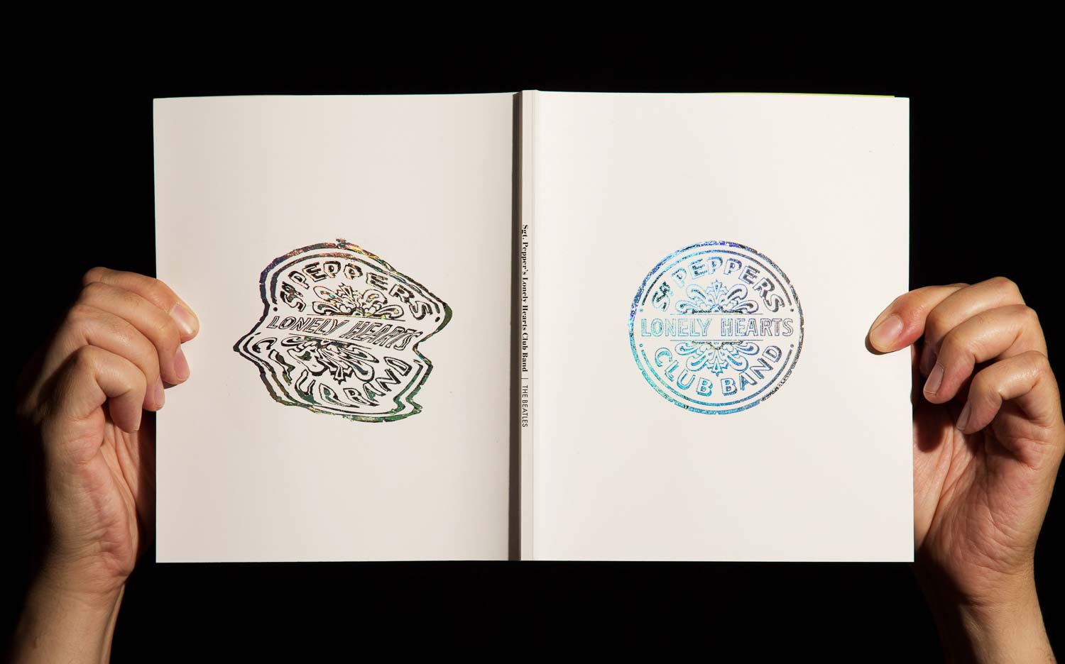
COver
As a way to push my concept further, I represented the sanity to insanity flow using the same distortion technique from the prose section. For added interest, I hand foiled the logos as a nod to hallucinogenics of the Sixties.
Additional Key Spreads