
The ProbLEM
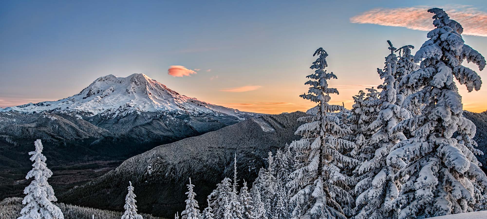
WNPF is the official philanthropic partner of Washington State’s three National Parks; Mount Rainier, North Cascades, and Olympic. As a non-profit organization, the majority of their budget goes towards the admirable job of taking care of our parks, consequently, their brand and site have become outdated. WNPF has ambitious goals for the future and dreams of a modern site that will match. My role was to reimagine their site to make a lasting impression on visitors and turn casual site browsers into WNPF supporters.

Made as a conceptual piece at the School of Visual Concepts
Instructor: Jim Catel
Timeline: 9-weeks
Tools Used: Photoshop, Illustrator, Sketch, Invision, Principle
Skills: Brand Discovery & Development, User Research, Information Architecture, Wireframes, UI/Visual Design, and Interaction Design
“WE PROTECT NATURE NOT FOR NATURE’S SAKE BUT FOR OUR OWN SAKE BECAUSE IT’S THE INFRASTRUCTURE OF OUR COMMUNITIES.”

Process

Current Site
Client Needs & Wants:
• Clear explanations of goals and purpose
• Easier website updates.
• Lasting Impression
• More donations
• More community involvement, volunteering
01. Build For the Future
As a non-profit, WNPF relies on supporter donations, both financial and time, to fuel their efforts. The client provided robust personas of their current member-base and additionally who they would like to target. Recognizing their desire to grow, I developed new personas based around the membership areas they need and want—Millenials and New Life Stages— both presenting opportunities for many years of continued support.
02. Minimize Decision Fatigue
WNPF has a lot to say, teach, and inspire in their visitors, but their original information architecture was unorganized and important links were hidden. I revamped their navigation to bring their most desired action items to the forefront, and removed unessential main nav items. I also organized their other sub-pages into a more intuitive, user-focused map.
03. Engagement from the beginning
WNPF needs to reinvent their website to provide immediate knowledge of their organization and the work they’re doing. In response to this need, I created a user flow that maps out a large but reasonable number of actionable and interactive elements a user will encounter when immediately hitting the landing page. Users will be able to access content nine different ways before ever hovering on a navigation menu option.
04. Early Iterations
Through sketches, lo-fi and hi-fi wireframes, I decided that content across the site will be maintained within cards to create a structured layout that highlights information without distracting from it. I allowed myself to continue sketching to produce the landing page interaction.
05. Nostalgic not outdated
With already having a distinguished brand, I opted to keep WNPF’s core brand guidelines intact and consciously mix the old and new. After learning about the goals and personality of the organization from the first client interview, I developed a short list of key words to frame the rest of the brand refresh on. To allow for more color contrast, I added a darker green and a new ‘donate’ CTA color. They now also have a new display typeface that inspires a sense of camping and outdoors nostalgia without looking tacky or unprofessional.
SERVICE, GROWTH, PASSION, action
“TAKE ONLY MEMORIES, LEAVE NOTHING BUT FOOTPRINTS.”
Solution

Opening Sequence Animation
Page and text transitions happen as the user scrolls, so they are in charge and can read at their own speed. Navigation is available from the beginning so the user can bypass if they chose to do so.
Modal Interaction
This non-traditional take on a home screen roll allows WNPF to curate the content on their terms, without the need of constant updating. Each parks modal pop-up contains three target areas, allowing the WNPF Marketing team up to three pieces of content they would like to direct users to go.
Navigation Interaction
Top and side navigation follow the user through their scroll so other options to navigate the site, explore owned social channels, or sign-up for the newsletter are readily available.
Mobile Ready
Like the desktop version, elements appear as the user scrolls. Due to having a smaller screen and lack of hover options in mobile, the modal pop-up feature was removed, and links directly to more information on that particular park.